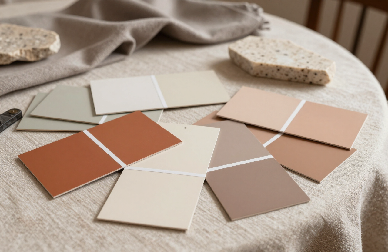
Ask a dozen designers for their fail-safe palettes and the same families keep surfacing. They share a structure: a warm neutral base, a mid-tone with earth in it, and one deep anchor. Within that structure, these five combinations have earned their reputations.
The five
Bone, tobacco, and charcoal — the warmest neutral scheme, ideal for north-facing rooms that need borrowed warmth. Ivory, sage, and walnut — green as a neutral, calming in bedrooms and studies. Cream, terracotta, and bronze — sunbaked and sociable, made for kitchens and dining rooms.
Oat, clay, and ink — the quietest of the five, a gallery palette that lets art and furniture speak. And greige, ochre, and espresso — the most forgiving, flattering both modern and traditional architecture.
Every enduring palette has the same skeleton: a warm neutral base, an earthy mid-tone, and one deep anchor.
Test before you commit
Paint large boards — at least 60 centimeters square — and move them around the room for two full days. Morning light, afternoon light, and lamplight will show you three different colors on the same card. Choose the one you like in the light you live in most.
And remember the 60-30-10 discipline: roughly sixty percent base, thirty percent mid-tone, ten percent anchor. Palettes fail from enthusiasm, not from taste — the accent is powerful precisely because there is little of it.